Thursday, December 5, 2019

The Future of Comics

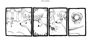
This week I read Perry Bible Fellowship Almanack from the course resource page.  This seems to be a collection of different comics from one artist, most of them being more comedic.  The also seem to be more on the adult and dark humor side of comedy, but nothing too graphic which is appreciated.  Most of the art styles are simple and easy to read, with flat colors and simple linework.  Most of the comics are also very short, being three to five panels at the most.  I really enjoyed reading these as they are easy to take in and almost stress relieving.  It kind of reminds me of instagram artists who make the really short-winded comics about things that are very easy to relate to. 

Upon reading about the author, Nicolas Gurewitch, it is said that these comics are intended to be a juxtaposition between whimsical imagery and morbid and dark imagery, which is presented pretty well in my opinion.  A lot of the comics have themes about love, religion, sexuality, war, etc.  Some of the comics I didn't completely understand, I'll admit.  Im assuming there is a button for the joke on each but maybe not. 

Specifically these were the ones that I didn't really get the joke.  But they were still fun to read regardless.


This one is one of my favorites though:


It's more light-hearted then the other more sexualized and morbid stuff but I still found myself laughing.  All three of these comics side by side also show off how off-the-rails the art style is, showing how Nicolas can change it depending on what he needs for that specific strip.

Reconsidering the Superhero

I decided to read Arkham asylum (1989) this week and I can say that this comic has probably the creepiest art style out of everything I have read this week.  It was really enjoyable to look at and I liked this interesting take on the already pretty dark art style of the batman comics.  The comic is written by Grant Morrison and illustrated by Dave Mckean.  The story follows Batman as he is called to handle a riot taking place in Arkham Asylum, an infamous psychiactric hospital that houses the most dangerous and iconic supervillains in the Batman pantheon.  This includes, but isnt limited to Joker, Two-Face, Killer Croc, Harley Quinn, etc.  As Batman ventures into the building he discovers how the building was created and the history of the man who built it.  The building itself seems to have a darker backstory then the reader would see coming.  I really enjoyed this comic and the beautiful artwork helped engage me in the creepy, dark theme of the story as Batman discovers the mystery of Arkham Asylum.  This story also has a very different vibe in comparison to other Batman comics, which usually come off as a little more classical (minus the Killing Joke.)

This comic really caught my eye because when I was younger I had the playstation video game Arkham Asylum, which is based on this comic.  The art-style for this game wasn't nearly as dark and disturbing, but the gameplay really brings you into the mystery and creepiness of the original 1989 comic.  I think it pays a pretty accurate portrayal to Grant Morrison and Dave Mckean's original work. 


Thursday, November 21, 2019

Assessment

1.)  I think The Killing Joke was a very interesting comic that delves into The Joker character and gives him a bit of backstory into his life and why he may be the way he is.  It also goes into the relationship between him and Batman, and how far they are willing to go in the midst of their constant battle.  Overall I really liked the story and found it fun to read.  I also really enjoyed the art style by Brian Bolland with his great line quality and expressions on characters (joker especially)  The comic is really gritty and dark but still fairly colorful.

2.)  I had a connection to this story because Batman was their first comics I have ever read.  It is really nostalgic to me and brings me back to reading these comics as a child.  Mostly it's the art style that connects with me the most, since it is so classic super hero comic style with the black shading and detailed character design.

3.)  If I had to adapt this story into a different media I would create an animated film.  I feel doing a stop-motion superhero film is something that hasn't been done before (If it has I haven't seen it.)  I think a Tim Burton like stop motion film thats really stylized to be a bit creepy would be something really interesting.  And considering this comic is something Tim Burton is a huge fan of, I feel it would be really great as a passion project of sorts.  I wouldnt make any changes to keep close to the source material.  It would need some more scenes to reach a movies run time.  Maybe include more backstory to Joker and even some more for Batman to drives home that there is a connection and similarities between them.

Comics By Women

This week I read Pretty Deadly by Kelly Sue Deconnick.  It was a really interesting story.  I also really enjoyed the art and line work, since i prefer detailed art when it comes to comics.  The style of the characters is also very interesting to look at as the comic seems to take an influence from westerns and horror.  It is a really cool and unique combination.  The story follows the daughter of death in a tale about retribution.  She rides on a horse made of smoke and has the marks from her father.  There are multiple issues but I have only read the first one.

I think this comic says a lot about women in the comic industry as it is pretty popular and easy to access, allowing it to reach many people.  It is nice to see something that is well-made by a talented woman be in circulation, not as much as traditional superhero comics but it's still nice to see.  There seems to be a pretty big community of people who enjoy reading this comic and enjoy the work of the author/illustrator. 

Comics as Contemporary Literature

This week I read Alice in Sunderland by Bryan Talbot.

Bryan Talbot self-inserted himself in this story as a guide through history, modifying his drawing style based on whatever he chooses to talk about.  This creates a very interesting comic to look at overall, with a lot of color and different line quality.  It's really satisfying to read and does a great job of combining story telling with history and myth.   I also like how it's told in an Alice in Wonderland type of style, as its very dreamlike.  Some of this comic is a bit lost on me but it is interesting nonetheless.

I think this comic has my favorite style of artwork out of any of the other comics I have read in class.  The realistic character designs and shading in the drawing portions (It kind of gives a sense of harsh lighting?) really adds to the tone of the piece.  There is also a really strange mixture of what looks like colored, realistic photos which I feel adds to the style.  It reminds me of a type of scrapbook.  I also feel this helps to the dream-like Alice and Wonderland inspiration is taking from, and helps bring you into the world seamlessly.  The character designs also achieve this, like for example the rabbit man in the beginning reminds me of Alice in Wonderland (but darker?)

Sunday, November 17, 2019

Manga and Japanese comics

I chose to read Lost World Tezuka Osamu.  The story is about a detective named Ban Shunsaku who meets a boy names Shikishima Kenishi after discovering a murder.  Shikishima may hold the key to solving the case.  Soon a stone is discovered that allows them to build a rocket that heads for a mysterious planet.  On this planet, the group finds The Lost World, an ancient place where dinosaurs roam.

The story, much like traditional Japanese comics tend to be, is very outside the box and unconventional.  It's a welcome difference from Western media as it really does allow for more creative thinking and situations.  For example, two characters names Ayame and Momiji are literally cabbages while another is a rabbit without much explanation.  I dont consider this bad by any means as I think It adds to the comedy (But Im not sure if that comedy is intentional which could be seen as a bad thing.

 The art-style also really caught my attention as it kind of reminded me of traditional Fliesher studios artwork in a way.  It's a far-cry from how anime and manga look today, as most of it has a pretty specific style.  Specifically I really like how the dinosaurs are drawn, because they are so expressive and fun to look at as they interact with each other and other characters.  The characters themselves were also very appealing and interestingly drawn.  Overall I really enjoyed reading this manga and hope to look into it again in the future.

Thursday, October 31, 2019

The Wide World of Comics

I chose to read Moebius 1 Upon a Star this week.  The art style for this comic is incredibly interesting and clean.  The use of color is very simplistic but appealing.  It give the comic a very specific look and definitely represents the time period from which it was made.  The character designs are also very simplistic while keeping basic human anatomy to a more realistic standard.

The first story is called the Repairman, which seems to be a short prequel of the main story.  We are introduced to tow main characters, a mechanic Stel and his helper Atan, who are called on to repair a vehicle on an alien planet.  It is discovered that the inhabitants of the planet are called the Waymasters and Stel must enter it to repair it.  In order to do this, however, he seems to have to reach into his own past in order to figure out how to achieve his goal.  It's an interesting premise with great visuals to go along with it.  Its also a nice way to get to know our two main protagonists in Upon a Star.

In Upon a Star, Stel and Atan crash land on a planet with very strange creatures that reside around a mysterious blue pyramid.  The pyramid seems to have really incredible power, despite nobody knowing what it is truly.  Stel begins feeling compelled to go toward the pyramid, adding to the mystery.  It is only at this point we begin to understand what is actually happening in this strange world.

The story is engaging and allows you to really be sucked into Moebius' work.  I really enjoyed looking into this story and hope to read more in the future if time provides.


Stereotypes and the ethics in representation

I have never been a fan of the use of stereotyping in comics even as a child.  I feel that anything that puts someone in an uncomfortable position strictly because of the race they are, gender, or anything else that is beyond someones control isn't right.

I don't think this kind of offensive stereotypical representation is at all necessary in video games, movies, etc.  It's a weak way to make a character in my opinion, as good and well-written characters have much more to them then a stereotypes.  Stereotypes also aren't that interesting, the shock value often being the only interesting thing about them.  In comics I can at least somewhat understand the use of stereotyping, so the characters that show up in one panel can be easily read. (Even if that stereotypical description is wrong)  I still think its a weak story telling tool regardless.

However, I do think it's important to hold onto these pieces of work as it shows a different time period and the effects of things like racism and sexism.

I know women are a common target for this type of stereotypical representation but I've never felt personally offended by it.   Usually I will watch whatever media is accountable and decide "Wow, they don't know what women are really like I guess" and move on.  I believe it doesn't deserve much attention if it is not well made.  This isn't to say that I think these past animations, comics, etc aren't well made, but if the character (For example a woman character) follows common stereotypes, offensive or not, I will write it off as a boring not-well written character.  Getting outraged by things like this, especially things from the distant past, is a waste of time.  However, critique is fair game.

Thursday, October 10, 2019

Maus

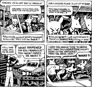
Maus is a graphic novel created by Art Spiegelman in 1980.  The story follows Spiegelman interviewing his father Vladek as he recounts his experiences as a jewish man during the Holocaust.  The story takes some creative liberties when it comes to the characters, depicting the Jews as mice, the Germans as cats, and the Polish as pigs in the story.  The story that Vladek tells beings in 1930 and goes until 1945 with the Holocaust coming to an end.  

Maus tells the story of the Holocaust directly from a true victim of the event.  Art recounts it through his beautiful and details artwork that helps bring you into the world history.  Art depicts this story as an actual interview, it shows that the story is being told by Vladek in real time through a flashback style. This style is really interesting and sometimes comes off as comedic when Art trying to keep Vladek on track with what actually happened when he starts going off topic.

The story keeps it's dark tone, which I think is necessary given the story being told.  But it also takes some breaks in between for comedy and light-heartedness (Similar to Barefoot Gen)  It would be a bit too exhausting to keep the entirety of it dark, even though the subject material isn't very comical at all.


The story also presents many interesting themes that aren't usually addressed when it comes to Holocaust stories.  There's an important scene involving a hitchhiker, as a character wants to pick him up to give him a ride only for Vladek to express disdain.  Despite the man being respectful and expressing how grateful he was, Vladek spent the ride fearing he would rob them.  It's an interesting insight regarding racism, as it seems that even people who have suffered at the hands of it can be oblivious when interacting with people they regard as different.  I think Art included this scene about his father purposely, not to make him out to be a terrible person, but to show the reader that racism is something anyone can be guilty of, and that it doesn't amount to anything except breeding more hatred amongst people.  

Overall its a very interesting and informative story with beautiful work.  I think it is something I would definitely look into again.


Thursday, October 3, 2019

Underground Comics

These comics are interesting for the time period for which they were released.  I feel for much of it was the early ground work for more storytelling that is geared for the adult eye, something that wasn't present nearly as much in the past (or arguably even now).  While i'm not one who typically enjoys these types of comics, as an artist I can appreciate them being made very well, as well as the representation (SOME) of them present.  I can also appreciate the artist's creating them, given how censorship was in the 1970s.  Some strips that I have read, I feel are trying to be offensive for the sake of being offensive.  One example is the depictions of black men and women in the Zap comics, where the character designs are just ridiculous.  There is also the strip in Tits and Clits involving rape, where the artist tries to depict it in a romantic and almost positive sense.  I'm not won over by most of the claims unsurprisingly.  In a more positive light, these comics did give minorities a platform to write and create art (though some missed the mark with the offensive stuff I think)  Overall, I get the importance of comics like these, as they show a part of history that shouldn't be ignored or forgotten about in order to move forward, but I don't think I will be reading or revisiting any of these again like that other comics we have read in class.

Eisner and Thompson

Eisner and Thompson both have very different styles when it comes to comic book writing as well as artistic style.  Despite this there is a certain group of similarities present, even though it isn't obvious right away.  The stories Bill Eisner and Thompson write come off a bit like a documentary, deep insights on things they have done or are currently doing.  It's a unique approach as well as a bold thing to make a comic book about.  Both comics that I have read from the artists (Bill Eisner's Dropsie Avenue and Thompson's Blankets respectively) depict very realistic stories involving love, emotion and themes of memory.  Both artists favor heavy writing rather then comedic.  The stories are easy to relate to since you have probably experienced the problems the characters are going through at least once in your life, making everything you read very insightful as well as strangely nostalgic.  The drawings that both artists create are similar, but if you look deeper you can see subtle differences that make both styles unique.  Both lean towards more realistic anatomy for their human characters while keeping the faces similarly shaped.  Eisner approaches eyes a bit more realistically then Thompson (who favors the black dot eyes).  Both look like traditional comics, Eisner's looking a bit more like that of older superhero comic styles.  Both styles are also very appealing to look at as they also capture and support the stories Bill and Thompson are trying to tell.  It was really interesting trying to compare and contrast both these fantastic comic book artists.

The Comic Book

Some of my favorite comics to read include mostly superhero comics.  One of my favorites is the original Wonder Women comic created by William Moulton Marston.  Wonder Woman's original story involves her being sculpted out of clay by her mother Queen Hippolyta and was given life in the Amazon.  She was also gifted with super human powers as gifts by the Greek gods.

  Interestingly, this story of Wonder Woman's conception is actually very reminiscent of an actual Greek myth where a character named Pygmalion carved a woman out of ivory then fell in love with her, despite not at all being interested in women prior to sculpting.

The stories of Wonder Woman are very empowering in a tasteful way.  It makes the older comics all the more better when you look into it and see that it came out in the early 1940's, a time where female empowerment was much more scarce and society had very specific expectations of women.  While it is a positive thing to be happening, I feel in today's culture it's easy to make something like female empowerment come off as cheesy when not approached in a way that makes sense.

I also read some Ducktales comics, which I wasn't expecting to be too excited for since I prefer superhero stories when reading comics rather then straight up cartoons.  Though, I was pleasantly surprised by how easy it was to get into.  The stories were cute and comical, and it was a very easy read. (no surprise there)  Overall, the Ducktales comics are incredibly charming, very much like early Disney was known to be.


Sunday, September 15, 2019

The Comic Strip

After reading some of Winsor McCay's comic strips including Little Nemo and Dream of the Rarebit Fiend, I can say that I found it incredibly insightful.  It's interesting how these strips capture the time period in regards to the style and the text.  It's also cool to see the difference between Little Nemo and Dream of the Rarebit Fiend when taking a look at things like the art style and inclusion of color.   They are both fairly realistic when it comes to style, though both seem to favor having the classic black button like eyes.  This, however, doesn't mean the characters are not expressive.  Winsor McCay does a great job with drawing emotions on characters that help amplify the reading experience.  I also like his line quality a lot as it comes off as a bit sketchy.  It's not messy but it looks like it was drawn pretty quickly, this is especially true for his Dream of the Rarebit Fiend comic.

These comics are like a time capsule for what the world was like and how art was perceived back then.  The problems and situations as well as the dialog pulls you into this world.  The art style even reflects the art of the time period, as this is the type of work one would think of when asked about early 1900s comics.  It's interesting to see how comics have evolved as time goes on, especially when you compare Little Nemo to something like Archie, which is still around today.    I really enjoyed exploring these older comics.

Wednesday, September 4, 2019

Understanding Comics by Scott McCloud

One of the most interesting insights that Scott McCloud introduced in his comic was how we as humans see and recognize human faces in cartoons vs in real life.  It's interesting to see how the human brain can recognize a face in common object you see everyday.

I never thought about how, when talking to others, we're always slightly aware of what ourselves look like during the conversation.  I also never realized that we over simplify our faces in our heads, since we never actually seen our own faces in person (aside from reflections but that is much different then seeing yourself in conversation without staring at yourself in the mirror.)  This makes a direct connection to cartoons and how we see them as ourselves.

  Scott also goes into other reasons we see ourselves in comics through simply-made characters that pull themselves away from realism.  It makes a lot of sense, since comics and cartoons are often used by readers/viewers as a form of escapism from real-life.  People don't always want to see a highly-realistic story, but something more light-hearted since it is easier to listen to and absorb.  Scott states that, "When you see a realistic face drawing of a face, you see it as the face of another.  But when you enter the world of a cartoon, you see yourself."  Being aware of the 'messenger', or author, can take a reader out of it and make him/her less likely to take in the story or lesson.  It's really fascinating to understand the science behind why people are so interested in the cartoon/comic world.

Thursday, August 29, 2019

The Arrival

The Arrival by Shaun Tan shows an interesting take on what a family can go through when in the process of immigrating to a new place.  The comic has a realistic style but throws in a mix of very stylized locations and creatures to add to the concept.  The story follows a father who travels separately from his daughter and wife to a new location that comes off as very alien and strange.  Along with learning how to cope with this new environment the father struggles to find work and to communicate with locals.  Common obstacles that real immigrants face.

The comic depicts the plot in a way thats easy to read and understand, despite having no dialog whatsoever.  I believe this is done successfully because the characters come off as so realistic that you can easily relate to them and understand their struggles, even if you have never experienced moving to a place thats new.  Without any words the comic has to depend solely on the acting of the characters as well as the designs of people and creatures.  There is also many side characters (who are also immigrants) with their own stories on how they have come to be in this new place, which adds more weight to what our main character is going through.  These side stories add a certain tone that only intensifies the struggle that many people go through, and gives the reader the same feelings in a sense.

This is done throughout the comic, the author taking situations that are strange and unnerving and translating them in a way that makes sense to the reader and gives you a taste of what the characters must be feeling.